2019 visualized
Happy New Year!
The BeeBIT team wishes you a happy new year 2020!
Since the start of the project in 2013 a lot of work has been put in development and operation of the eHives. In 2015, the first eHives were shipped and the association »BeeBIT e.V.« was founded. Our database is growing daily ever since. As the decade ends, we had a brief retrospective of 2019 in mind to thank the people and institutions that are working with our/their eHives. Enjoy the following text and make sure to check out the supplementary materials!
2019 visualized: AUT-BIE-1
The aim of this blog post is to show a huge amount of data (often more than 60 MB per eHive) in a figure that is small in size and reasonably easy to understand. We picked eHive AUT-BIE-1 as an example because this hive collected data over the whole year 2019 without interruption. However, other eHives with enough data were not ignored and a figure similar to the one shown beneath was created and can be downloaded from our website, c.f. supplementary materials at the bottom of this blog post.
Don't worry, the following figure is explained in detail in the text underneath.
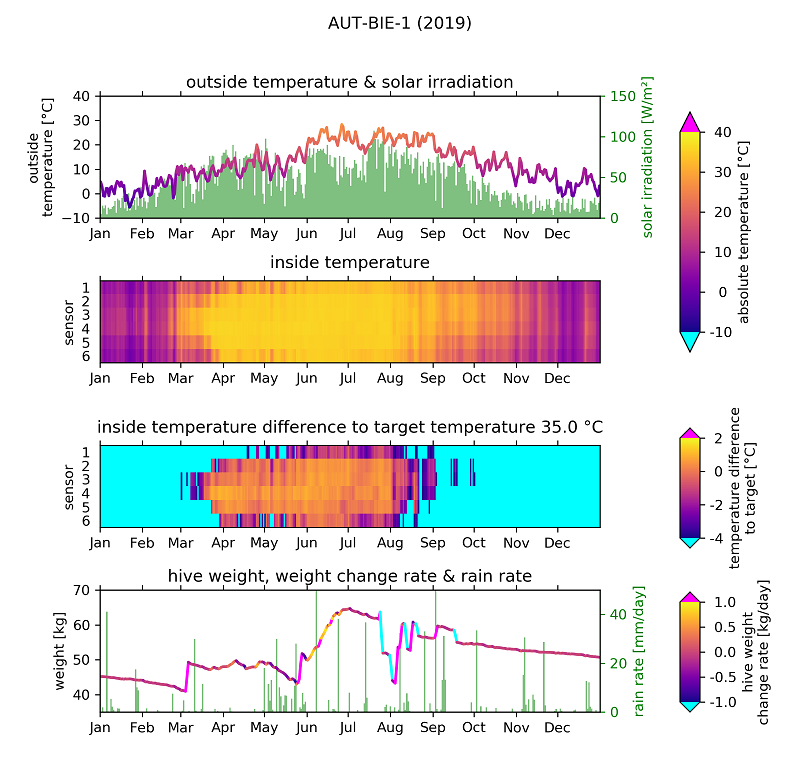
Outside Temperature & Solar Irradiation
The data from the temperature sensor of the weather station (as well as all other data shown) was downloaded from the website's diagram viewer and averaged over 24 hour long intervals. The calculated daily mean is plotted as a line graph where the lines connect daily mean values (365 points) and are colour-coded according to the mean value of the two connected points. The colourbar is shown on the right. On the x-axis the beginning of each month is labeled for better orientation. Dates were calculated using local summer time (that is UTC+2 for Austria where AUT-BIE-1 is located).
On a second y-axis the solar irradiation is visualized in a bar chart. Please note that since we calculated daily mean values, the irradiation during daytime (especially at noon) may be considerably higher.
Inside Temperature
The temperatures inside the eHive are visualized as one block consisting of 365x6 colour-coded tiles (365 days and 6 sensors). The same colourbar as for the outside temperature is used. This approach makes it easy to track the colony's position inside the hive just by looking at the colour of the tiles: If we take a look at the months March and October, we observe that the colony moved from between sensors 3 and 4 in March to sensors 2 and 3 in October.
Temperature Difference to Target
The breeding temperature of a bee colony is circa 35 °C. We can use this information to track when and at which position inside the hive the colony might breed. Therefore, we visualize the deviation from this target temperature. Of course, we have to use a different colorbar for this task. If the deviation is small for an extended period of time, it is very likely that we found the breeding combs. In our example breeding begins around the midst of March and ends mid-August to September.
Hive Weight, Weight Change Rate & Rain Rate
In the last subfigure, the hive weight is shown in a line graph. The 365 mean values are connected by colour-coded lines. The colour corresponds to the weight change rate between two connected points (and is therefore a measure for the line's inclination). Again, the colourbar can be seen on the right. In the data, some jumps with a change rate of more than 1 kg/day can be seen. Most likely, this is a result of the beekeeper's work, e.g. adding or removing a honey shroud. A sudden drop in weight (especially during summer) might also signalize a swarming event.
On a second y-axis the rain rate is visualized in a bar chart. Please note that mm/day is equal to litre/(m² day), using 1 litre = 1 dm³. By taking a look at the beginning of June (around the 6th or 7th), one can see how extensive rainfall leads to a decrease in the weight change rate.
Supplementary Materials
Data from the following eHives was visualized:
DEU-DHG-1, DEU-FKG-1, AUT-WIS-1, AUT-BIE-1, DEU-MNG-1, DEU-OEG-1, DEU-FDG-1, DEU-LPG-1
- figures (as PNG & PDF) for all above mentioned eHives: 2019_figures.zip
- corresponding raw data: 2019_data.zip
- Python script: 2019_script.py
(cw) 2020-01-01
Advanced data analysis
Based on an introductory blog article on how to analyse raw data, we now want to examine longterm trends. In this article, we want to identity the environmental factors which contribute most to the weight development inside a beehive. In order to do this, we will use the data by the eHive at the AGES (AUT-BIE-1), since there have been neither technical issues nor human interventions over the course of this summer. We are interested most in the timeframe from end of May to end of July, since this is the time when bees collect most nectar.
For Context: The »bee year« starts and ends with summer solstice, i.e. the calendar beginning of summer on June 21. Until then the bee colony grows, i.e. a lot of bees hatch. After, the queen reduces oviposition and the colony prepares for winter. Additionally, the flowering of most crops is over, and it becomes more difficult for the bees to find food.
Disclaimer: In a highly complex biological system such as a bee colony a lot of different processes can influence the weight development. This article concentrates on only one colony, and makes some exemplary observations based on a few select weather values. This of course doesn’t prove that a statement is valid for most or all bee colonies. Furthermore, found correlations don’t imply causation. Instead, the article is supposed to demonstrate what can be examined from eHive data.
1) Data Download
First, we will download the data from the diagram view on the BeeBIT homepage. As working hypothesis, we assume that the weight development correlates with solar irradiation and exterior temperature.
Why especially these environmental factors? We expect the hive weight to increase when the bees collect most nectar and pollen. This implies to conditions that have to be fulfilled:
- The bees must be able to fly out, so it should be appropriately warm, and there should be neither storm nor rain.
- Plants must provide nectar. This depends on many factors, but basically it should be neither too wet (rain washes the nectar away) nor too hot (nectar dries out).
Therefore, we included the data Hive »weight«, »Exterior Temperature«, »Interior Temperature 3«, »Solar irradiation« and »Exterior humidity« in the dataset.
In Fig. 1, we only detect a few general trends: the hive weight increases steadily until end of June and then slowly decreases in July, also the interior temperature is nearly constant at about 35°C. With NumPy we can calculate daily averages of the data. For the weight, we don’t need the average but the difference of two values at midnight, c.f. Fig. 2.

2) Influences on the hive weight, June
Still too chaotic? We will simplify the data even further in a minute. We spot in the first month (before summer solstice), that a high solar irradiation (green curve) correlates with a high increase in hive weight (blue curve), and that the weight increase is rather low (or even negative) on days with low solar irradiation. Later, this correlation appears to become weaker.
Apparently, something changes within the colony, and this possibly has something to do with summer solstice. We now plot all data points of the first 40 days (up to 2019/07/08) in a scatter plot, c.f. Fig. 3. The horizontal position of a day is determined by the weight difference, the vertical position by the solar irradiation. The color indicates the exterior temperature.

The presumed correlation apparently really exists! On days with high solar irradiation, the hive weight increases more than on days with low solar irradiation. We assume that larvae don’t grow faster or slower depending on solar irradiation, so the observed difference probably comes from collected nectar. There are, however, a few outliers, which we will discuss later: days with high solar irradiation where the hive weight decreases (top left corner) and days with low solar irradiation where the hive weight increases (bottom right). These outliers are labeled with their day, so we can find them later.
Also, the weight change appears to be relatively independent from the exterior temperature in June.
3) Influences on the hive weight, July
This changes in July, therefore we exchange the horizontal axis. The color of the points now correlates with solar irradiation, c.f. Fig. 4. The plot contains all days starting from day 25 (June 23).

Apparently, the exterior temperature is the governing factor for weight development after summer solstice. This can be well explained: At the beginning, we saw that the interior temperature remains approximately constant. Consequently, the bees have to actively heat on most days, i.e. consume food – and they do so the most on coldest days. They also consumed food in June, but during days with high solar irradiation they were able to collect more food than they consumed. These two factors appear to govern the weight change. From literature we know that most bees hatch before summer solstice, which contributes to the high difference of the absolute values of weight change in June and July.
4) Outlier
We notice that there are outliers in both scatter plots. Ideally, we can find an explanation for these using the BeeBIT data. As example, we concentrate on the outliers in June.

We still have some weather factors which have not been analyzed yet: Precipitation and air pressure. When we mark the outliers of the first scatter plot, we discover that they often appear near heavy rain, often the day before or after, c.f. Fig. 5. The red points are days where more nectar was collected than on days with comparable solar irradiation, the black crosses are days where less than usual is collected.
For the two black points, we can find a simple explanation: On the day after rain, the flowers are still wet, the bees have difficulty reaching the nectar. Therefore, they are collecting less, even if the sun is shining.
The red points appear either on the days before rain or one or two days after rain. Since the bees appear to target a weight increase of 0.5 kg/day, the work more on days after rain (compensation of lost time). Furthermore, plants might provide more nectar during these days. Also they are more productive on days before rain (which can be anticipated from lower air pressure), see days 7 and 23. The bees appear to factor future weather changes into their schedule, and know that they have to make up leeway after losses during rainy days. I was unable to find this observation in the literature, and it should be evaluated more thoroughly. Unfortunately, there currently are very few other datasets, where there have been neither human interventions nor technical problems nor swarm events during an entire summer (i.e. no sudden jumps in weight). As soon as we’ve developed a working bee counter, this hypothesis could be verified or falsified.
5) Summary
- In the main blooming period in June, the weight increase correlates with solar irradiation and less with temperature.
- In July the weight difference correlates with temperature and less with solar irradiation, since the bees must heat the hive.
- Outliers appear on days before or after rainfall. The bees seem to anticipate the rain and compensate bad days on the following days, even if the weather is not ideal for nectar collection.
Some factors of influence have not been discussed due to insufficient data, i.e.:
- Plants need water to produce nectar.
- We are unable to decouple weight increases due to reproduction and weight increases due to nectar collection.
Supplementary Materials
- this blog article as PDF: analysis2.pdf
- used raw data: data.txt
- Python script: script.py
The eHives' sensors & errors of measurement
Bee hive
Temperature
Pt1000 measuring resistors of accuracy class AA are used for measuring temperatures inside the eHives. They are calibrated to an accuracy of ± (0.1 °C + 0.0017 ∙ T) with T being the temperature in °C. Because the sensors are connected by a two wire circuit to the electronics for further signal evaluation, the line resistance also causes an error. Since the length of this circuit is small, the associated error should be comparatively small as well. On the circuit board, the sensors are connected in series with a 4.7 kΩ precision resistor each and a reference voltage of 10 V, c.f. Fig. 1. The precision resistors are exact with a tolerance of 0.1 %. The reference voltage is created by an ADR01ARZ with a tolerance of 0.14 %.
Now, the voltage difference between the temperature sensors and the reference voltage is digitised using an AD7789 analog-digital-converter (ADC). The ADC's ± 0,3 μV offset can be neglected because the change in voltage for a 1 °C temperature difference amounts to 5.7 mV. The ADC's resolution of 19 bit with a reference voltage of 2.5 V yields an effective resolution of 4.8 μV. In consequence, the ADC's contribution to the measurement error can be neglected as well. The 2.5 V reference voltage is created by an ADR03ARZ with a tolerance of 0.14 %, being equal to the tolerance of the ADR01ARZ mentioned earlier.

The sensors' measuring resistor itself is shielded by a shell made of stainless steel which reaches up to 20 cm inside the hive and is located at around two-thirds of the honeycombs' height. Usually, a sensor should be in between two honeycombs. However, sometimes the bee colony integrated one or more sensors in the combs. This is especially the case for top-bar-hives. Since different types of hives are used, the sensors' distribution differs and may not even be symmetric. Usually, a sensor is placed in every second comb alley. The exact arrangement is shown in the following table, where each column represents a comb alley according to its number in the first row of the table. The maximum number of comb alleys is 14, while most of the eHives have less. (Dark grey cells represent non-existing alleys.) The numbers 1-6 (respectively 1-5 for eHives with only 5 temperature sensors) in the remaining rows mark the position of the temperature sensors inside the hive according to their label in the database.
| ## | eHive ID | 01 | 02 | 03 | 04 | 05 | 06 | 07 | 08 | 09 | 10 | 11 | 12 | 13 | 14 |
|---|---|---|---|---|---|---|---|---|---|---|---|---|---|---|---|
| 01 | DEU-DHG-1 | 1 | 2 | 3 | 4 | 5 | 6 | ||||||||
| 02 | DEU-FKG-1 | 1 | 2 | 3 | 4 | 5 | 6 | ||||||||
| 03 | AUT-GSC-1 | ||||||||||||||
| 04 | AUT-WIS-1 | 1 | 2 | 3 | 4 | 5 | 6 | ||||||||
| 05 | AUT-BIE-1 | 1 | 2 | 3 | 4 | 5 | 6 | ||||||||
| 06 | ITA-FEM-1 | 1 | 2 | 3 | 4 | 5 | |||||||||
| 07 | ITA-FEM-2 | 1 | 2 | 3 | 4 | 5 | |||||||||
| 10 | POL-LOK-1 | 6 | 5 | 4 | 3 | 2 | 1 | ||||||||
| 12 | DEU-BGT-1 | 1 | 2 | 3 | 4 | 5 | |||||||||
| 13 | ITA-LFV-1 | ||||||||||||||
| 14 | DEU-MNG-1 | 1 | 2 | 3 | 4 | 5 | 6 | ||||||||
| 15 | DEU-OEG-1 | 1 | 2 | 3 | 4 | 5 | 6 | ||||||||
| 16 | DEU-FDG-1 | 1 | 2 | 3 | 4 | 5 | |||||||||
| 17 | DEU-LPG-1 | 1 | 2 | 3 | 4 | 5 |
Humidity
The air humidity inside the hive is measured using a SHT21 humidity sensor. This component is sold in a system that converts the digital signal into an analog signal using a PIC32MX micro controller. In consequence, the signal must be digitised again on the main circuit board. The tolerance of the sensor component is 2 % for humidity values between 20 % and 80 %. It increases linearly to 3 % for humidity values approaching 0 % or 100 % respectively. We guess the convertion to an analog signal increases the measurement error by approximantely 0.5 %.
Because the humidity sensor is located in the lower part of the hive below the combs, the measured value correlates heavily with the outside humidity. Since the sensor is relatively huge in dimensions, it was not possible to place it in a higher location of the hive where the colony's micro climate can be monitored better.
Scale
The eHive measures the hive's weight using load cells of type SEB46B, c.f. Fig. 2. On a spring torso made of stainless steel, attached distention straps change their electrical resistance depending on the load acted on the torso. Combining multiple distention straps to a Wheatstone bridge, the bridge's output voltage is amplified using an AD623 instumentation amplifier and then digitised using an AD7789 ADC (c.f. temperature section above). The voltage source for the Wheatstone bridge is identical to the one for the temperature sensors. The amplifier increases the signal strength by a factor of 99 with a deviation of 0.35 %. The amplification factor is regulated by a resistor and inherits its 0.1 % tolerance. The load cell's resolution amounts to 0.2 μV/g prior respectively 19.8 μV/g after amplification.

The load cell's smallest possible resolution is 6.6 g according to its spec sheet. At constant temperature this resolution can be reached by our weight measuring system. However, temperature changes can result in weight changes of some one hundred gram. Rainfall can lead to additional deviations because not all eHives are equipped with a roof (c.f. blog post The eHives' locations and surroundings). The sensors' drift over long periods of time is not known.
Weather station
All weather data, except air pressure, is measured by the weather station Vantage Pro 2 from supplier company Davis. Since the measured values are read out digitally all tolerances can be taken from the weather station's spec sheet. In the following paragraphs additional error sources and external influences are listed.
Outside temperature and humidity
For measuring air temperature and humidity in a comparable manner, the weather stations must be installed on a open area with defined surface and in equal height. However, reality is complicated and in consequence some weather stations are located on grassland, some on roofs, etc. which may influence the measured values. Nonetheless, it was tried to install the station around 2 m above the hive to monitor the relevant local micro climate at the hives' site.
Rainfall
Rainfall is measured with a seesaw below a funnel. As soon as a well-defined amount of water accumulated in one of the seesaw's two shovels, the seesaw dips over and activates a Reed relay using a magnet attached to the seesaw below its turning axis. One dip translates to 0.2 mm of rainfall. As a consequence of this technique, snow can only be measured in the process of melting, supposing it was not blown away from the funnel due to high wind speeds and/or the funnel's overflow prior to melting. Though electrical heating components are installed inside the rain meter at some of the eHives' locations, those heating components are not in use in most places due to low effectiveness. On top of that, the funnel sometimes gets blocked and may not be cleaned regularly, resulting in measuring zero rainfall over long periods of time.
Wind speed and direction
Equally to air temperature and humidity the weather stations installation site may influence the wind values. The height of the wind sensor is supposed to be around 5 m above ground but can deviate heavily at some locations. For measuring the wind direction, the sensor must be oriented exactly northwards. However, that is not always possible to a high precision, so the measured absolute values may deviate by some degree. The listed measurement error is a relative error.
Solar irradiation and UV index
At some locations the two irradiation sensors are shadow-casted by trees of buildings during parts of the day. Usually, once a day the shadow of the installation mast casts the sensors. This happens because the two sensors are attached to the weather station's base component and in consequence to the fact that in most cases both the base component and the wind sensors component of the weather station are installed to the same mast.
Air pressure
For measuring air pressure a BMP280 sensor is used which is located on the main circuit board. The sensor's output is digital and therefore the measurement error in the spec sheet can be adopted.
Internal sensors
Complete current and radiator current
For measuring currents ACS712 sensors are used which supply a voltage proportinal to the current. This voltage is digitised using the Arduino's internal 12 bit ADC that works with a maximum voltage of 3.3 V and therefore theoretically exhibits a resolution of 0.81 mV. Since the current sensor outputs 0.185 V/A, one step of 0.81 mV translates to a change in current of 4.4 mA. According to the sensor's spec sheet its resolution amounts to 75 mA, which was rounded to 0.1 A due to the small effective resolution of the Arduino.
The sensor for the radiator current can be allocated freely. For example, it would be possible to measure the charging current if an eHive is powered by battery.
Charging voltage
The charging voltage is the voltage at which the electrical system is operated. Since as of today this voltage is supplied by a power-supply unit at all eHives and therefore is almost constant, the name is a bit confusing. The voltage is measured using the Arduino's ADC after being reduced by a voltage divider using a 1 kΩ and a 4.7 kΩ precision resistor. The resisitors' contribution to the total measurement error can be neglected. The theoretical resolution therefore amounts to 4.4 mV, however it was rounded up due to the small effective resolution.
Microchip temperature
The Arduino's mirco controller features an internal temperature sensor which absolute value must be calibrated individually for every single sensor. Since this was not done, the absolute values of this sensor exhibit an offset of ± 45 °C. The relative error amounts to ± 3 °C according to the spec sheet.
Tabular overview of measurement errors
(for details and comments c.f. sections above)
| Sensor | Error | Unit | Annotations |
|---|---|---|---|
| Inside temperature | 0.2 | °C | |
| Inside humidity | 2.5 | % | below 20 % and above 80 %: increase to 3.5 % |
| Weight | 0.01 | kg | higher deviations at changing temperatures |
| Outside temperature | 0.5 | °C | |
| Outside humidity | 3 | % | above 90 %: increase to 4 % |
| Rainfall | 0.2 | mm/h | above 4 mm/h: 5 % of the measured value |
| Wind speed | 3 | km/h | above 60 km/h: 5 % of the measured value |
| Wind direction | 7.5 | ° | relative error |
| Solar irradiation | 90 | W/m² | |
| Air pressure | 1 | mbar | |
| UV index | 0.8 | UVI | |
| Complete current | 0.1 | A | |
| Charging voltage | 0.01 | V | |
| Radiator current | 0.1 | A | |
| Microchip temperature | 3 | °C | relative error, offset ± 45 °C |
Supplementary materials
- this article as PDF: sensors_and_errors.pdf
(jg) 2019-09-20
Export and analysis of raw data
The diagram viewer of BeeBIT's website has a function to export raw data. That offers the possibility for a deeper analysis of the collected data. In the following article, temperature and weight data of eHive AUT-GSC-1 is studied to exemplify this statement. For better traceability the data export and the subsequent analysing attempts are structured in steps. Data processing is done using Python. The complete Python script as well as an explanatory PDF document are linked at the end of this article. The purpose of this text is to give inspiration and some examples of approaching the investigation of BeeBIT's data sets. As we will see: Many things can be noticed on second sight only.
1) Data export using the diagram viewer
In the diagram viewer data sets that will be examined afterwards can be selected and viewed intuitively. As an example we will take a look at the temperature data inside and outside of the eHive (6+1 sensors, the sensors inside are placed at different locations between the honeycombs) as well as the weight data. As a time frame we select June 10th until (and including) June 12th. Doing this, we must be aware that all times are given in the standard coordinated universal time UTC+0. As a consequence, the time in the local time zone (that is central European summer time UTC+2) will be shifted by 2h. So for looking at the three day timespan from midnight to midnight in local time UTC+2, we want to export data from June 9th 10 pm until June 12th 10 pm in the diagram viewer's default time UTC+0.
By clicking the Download button in the upper right corner a csv data file containing the selected sensor data sets is generated by the server and provided for download. This file can be opened using text editors or spreadsheet programs. However, since we also want to perform computational heavy tasks on the data, a script in the high-level programming language Python is used to read, analyse and illustrate the data set.
Nevertheless, we first open the csv file with a text editor to grasp the data set's structure. The default name of the downloaded file is data.csv. In the first line the names of the archived data sets are saved. The raw data is stored in the following lines where a line break divides two consecutive time steps. Inside a line the semicolon is used to separate two data points. Hereby we can structure the file into rows and columns. The first two columns of each downloaded csv file contain time information: in the first column as Unix timestamp in decimal representation, in the second column in a human-readable format. In the other columns the beforehand selected sensor data is stored, each column corresponding to one sensor. If data from before or after the selected 72h timespan is still stored in the file, it could now be deleted manually.
The first and last three lines with raw data from the downloaded file data.csv are printed here. The names/identifiers of the data sets are not shown.
1560117600;Sun, 09 Jun 2019 22:00:00 GMT;28,5;28;30;34;34,3;34,9;52,61;221560117660;Sun, 09 Jun 2019 22:01:00 GMT;28,5;28;30;33,9;34,2;34,9;52,61;22
1560117660;Sun, 09 Jun 2019 22:01:00 GMT;28,5;28;30;33,9;34,2;34,9;52,61;22
...
1560376620;Wed, 12 Jun 2019 21:57:00 GMT;30;30,1;32,4;34,5;33,9;34;58,04;25,7
1560376680;Wed, 12 Jun 2019 21:58:00 GMT;30;30,1;32,4;34,5;33,8;34;58,03;25,7
1560376740;Wed, 12 Jun 2019 21:59:00 GMT;29,9;30,1;32,4;34,5;33,8;34;58,03;25,6
2) Visualisation of the raw data using Python
Since we have understood the structure of the data we now want the computer to read it using a script. After that we try to visualise the raw data unaltered before we go on with further analysing steps. In the paragraphs below we use the free programming language Python 3 in combination with its external function packages NumPy and Matplotlib. Python is platform-independent and relatively easy to learn. Thus, the presented analysing methods could be applied and expanded by students with interest in computer technology, e.g. within the scope of a school project.
First of all, the data is read and saved in NumPy-arrays for plotting it over time using Matplotlib, cf. Fig. 2. Since only the relative time information is relevant to us, we can organize the horizontal time axis in units of hours with 0h representing June 09th 10 pm (UTC+0, June 10th 00 am in local time). Because both temperature and weight data is stored in the data file we will need two vertical axis: one in units of °C, the other one in units of kg. Different colours and a legend will be used to distinguish the sensors. As a guide to the eye two vertical lines with a time spacing of 24h are inserted to mark the day change at midnight in local time.
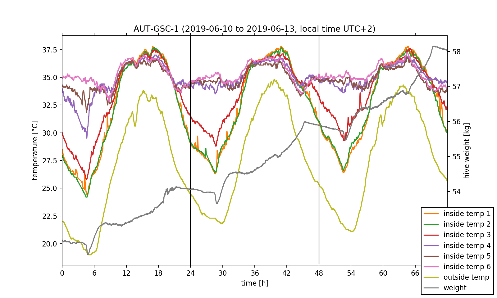
We have already accomplished the hardest task! Now, that we understood the data set's structure and managed to visualise the exported data, we can perform some investigations on it. Before doing this, we want to point out that just by looking at the temperature data one can already get an insight on the position of the bee colony inside the hive. As it can be seen in the plotted temperature curves, the inside temperature sensors 4 to 6 show little change in the measured values and fluctuate by approximately 3 °C around a mean value of 35 °C. This exactly meets the target temperature the bee colony needs for the larvae brood. In contrast, the fluctuation amplitude of the sensors 1 to 3 is nearly 10 °C. As a consequence, we can conclude that the colony mainly lives near sensors 4 to 6.
3) Analysis of the temperature regulation
We now would like to deeper investigate the observed temperature regulation as this would be possible with the diagram viewer on the BeeBIT website. Especially the differences between the temperatures inside and outside of the hive depending on the position of the inside sensor are of relevance to us. Therefore, we exemplary select sensors 2 and 5 and plot the inside-outside difference. Since we want to make a more general statement which should not be dependent on single events during data capture, we take the daily mean over the three day timespan, that is we calculate one mean temperature value out of three values measured on three days at the same time. NumPy's fast and intuitive array handling makes this an easy task. The complete 72h data set as well as the 24h mean are shown in Fig. 3. For both a shared temperature axis is used.
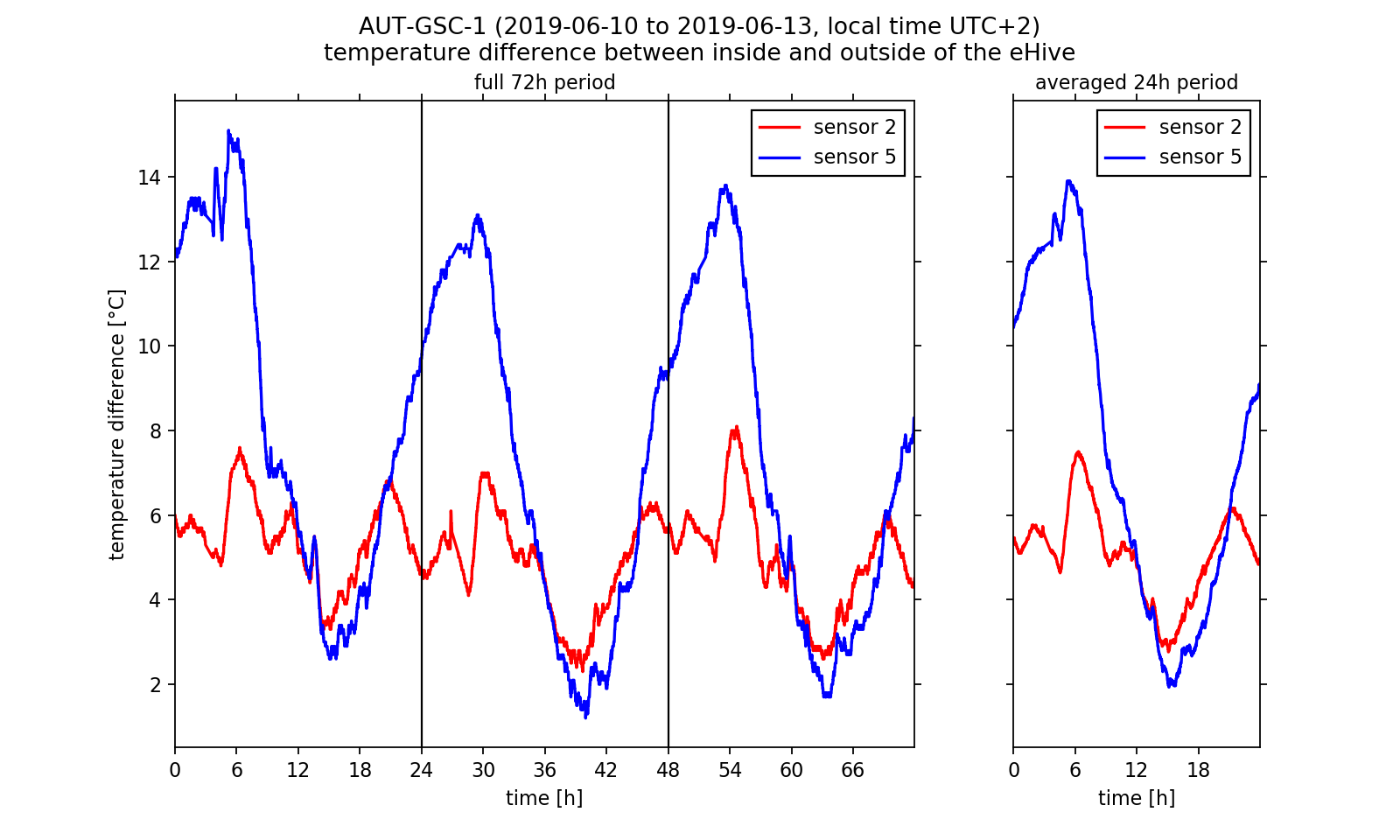
Looking at the inside-outside difference we can conclude that the bee colony regulates the hive temperature. We already have stated that the colony is located near sensors 4 to 6. During night time the hive is heated there so that the temperature does not fall too low for the larvae brood. Near sensor 2 the temperature follows the outside temperature curve. Between 2 am and 7 am the inside-outside temperature difference at sensor 5 reaches a maximum of approximately 14 °C in the three day average. We get a completely other picture if we look at the warm afternoon and evening hours: Here the temperature difference at sensor 5 falls below the values at sensor 2. If we assume that the curve at temperature 2 follows the outside temperature nearly unperturbed (with a constant offset value), we can conclude that the colony actively cools the surrounding brood-/honeycombs. Indeed this behaviour was observed by beekeepers. Worker bees carry water into the hive which evaporates and dissipated heat so that the hive stays cool. Thus, we have reason to believe that we were able to observe this interesting phenomenon in the analysed data!
4) Analysis of the weight change rate
After investigating the temperature regulation inside the eHive we want to conclude this article by analysing the weight readings. As one could already have noticed by using the website's diagram viewer, the hive weight increases from 52.5 kg to approximately 58.0 kg within the three day timespan. However, the absolute weight of the hive contains the weight of all associated components (wooden frame, sensors, IT components, biomass). Another quantity that can describe the relative weight change is of more interest to us: the change rate, that is the time derivative of the weight readings. This quantity can be calculated by subtracting two neighbouring data points and divide the result by the length of the corresponding time step. If we visualise the calculated change rate (Fig. 4, upper half) we notice that the measurement signal is very noisy. The noise reduces if we again calculate the three days mean. However, we still cannot make a reasonable statement about the weight curve using this data.
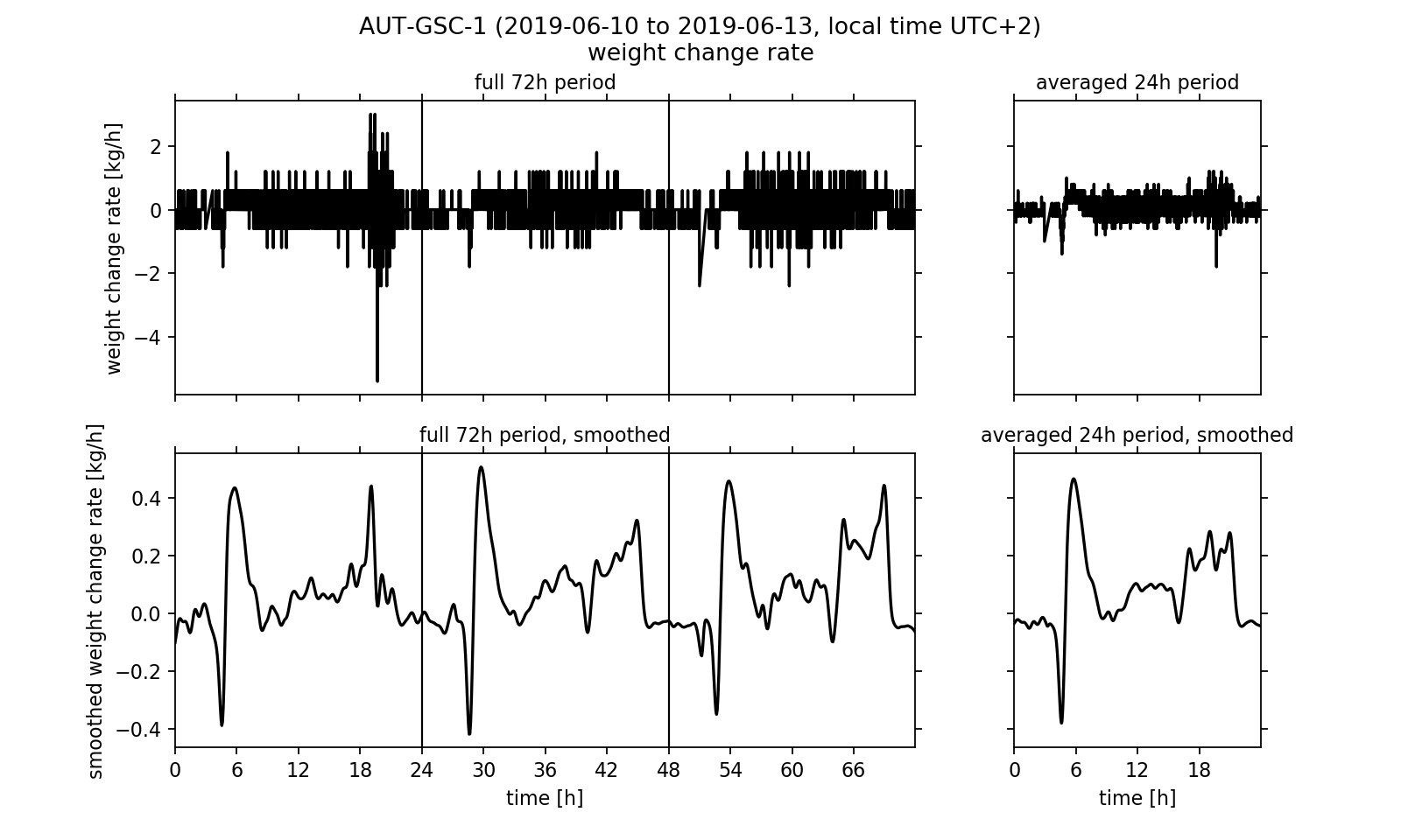
It would be desirable to process the data in a way that removes the noise from the signal without changing the underlying meaning of the measured values too much. One known method of noise suppression in signal processing is the use of signal filters. We will apply the so-called Gaussian filter to the signal. For this purpose, interpolation points are calculated from the data points. Here, the individual data points that are used to calculate an interpolation point are weighted differently. A data point that is close in time to the interpolation point is weighted more heavily than a data point many minutes or even hours away. The weighting corresponds to a Gaussian bell curve, which is centred over the respective interpolation point. Details on the interpolation and its algorithmic implementation are linked at the end of the article in the form of an explanatory PDF file.
In the smoothed curves (Fig. 4, lower half) we can see that especially in the evening between 4 pm and 8 pm the hive's weight increases strongly with up to 0.3 kg/h. Overall, a positive balance of the change rate is observed, that is in daily average it is greater than zero. This effectively leads to an increase in the hive's weight, which we already noticed at the beginning of the analysis. Surprising is the strong rash in the early morning: After the weight first decreases sharply with up to -0.4 kg/h, it rises up to +0.5 kg/h again shortly afterwards. At 9 am in the morning, the rate of change then has dropped back to about 0.0 kg/h. This effect can be seen on all three days of the observation period and is also reflected accordingly in the three-day average. Meikle et al. interpreted the sharp decline at dawn as a wake up phase of the bee colony. While the workers prepare for the first flight of the day (heavily consuming food) and then gradually leave the hive, the weight drops. The subsequent sharp increase could not be found in the publication by Meikle et al.. It may be possible, for example, that the bees carry water into the hive. However, the change in weight may have no biological cause. One can think of it being caused by the morning dew precipitating on the outside of the hive. A quick look on the website's diagram viewer could reinforce this second guess: just at the time that the weight change rate rises sharply after the wake up process, the outside humidity reaches a maximum of up to 80 % on all three days of the observation period.
5) Conclusion
We exported data from the BeeBIT diagram viewer and processed and visualised it with a Python script. The temperature regulation in the inside of the hive and the weight readings were examined in more detail. The difference between two internal temperature data sets and the time derivative of the weight curve was calculated numerically. On the latter, a Gaussian filter was applied to suppress the noise of the measurement signal. The methods shown are intended as examples of reasonable analytical approaches. Such approaches are used in scientific research, but can also be developed by students or interested adults. The eHives are providing interesting and interpretable data sets. The shown data analysis methods can be varied in complexity and their degree of difficulty. Working with just a small set of data in an easy-to-use spreadsheet program can also generate new insights. (An example suitable for school lessons can be found on the BeeBIT website in the learning materials section under the title Data analysis with simple functions and charts. There, data on outside temperature and precipitation are organised and visualized in an Excel spreadsheet.) In-depth numerical analyses, as they could be carried out in school or university projects by older pupils or students, allow a thorough study of the biological aspects of the collected data and the technical methodologies.
If this article, dear reader, has piqued your interest, do not hesitate to try it out for yourself. Download a data file from the diagram viewer, open it with a program of your choice, and take a closer look than you could before on the website. As promised at the beginning of the article: Often a second look is worthwhile.
If you need any kind of help, have questions concerning this article or want to tell us about your work with the eHives' data, feel free to contact us.
Supplementary materials
- this blog article as PDF: export_and_analysis.pdf
- used raw data: data.csv
- complete Python script: export_and_analysis.py
- supporting information, used methods and their implementation: supportingmaterial.pdf
(cw) 2019-07-20
New designed website
On the 1st of march a newly desgined website was launched at our web address https://beebit.de. The diagram viewer and the teaching resources management system were unaffected by this.
Since many month, we thought about a new design for our website and tried to expand and renew the published information. With the new website, a blog system was implemented in which small or big news can be released easily. At https://beebit.de/en/blog you find worth reading articles from the up-to-now spreaded newsletters. In future, the new written and published articles will be summed up to big newsletters in regular time periods. This provides the chance for you to access news on the blog directly without having to wait for a newsletter. In consequence, you can read the articles shortly after they are written.
Furthermore, the start page contains a new feature: a table with informations about the technical state of the eHives. As you may have noticed, not all eHives send data. We tried to make the reasons for this transparent in the table. It will be updated in regular time periods.
On the old website all up-to-now released newsletters could be accessed. The new blog system makes this largely unnecessary. However, if you wish to read the old newsletters, they can be downloaded by clicking on the following links. You will be redirected to the corresponding PDF file on our server.
- Newsletter_2015_08_EN.pdf
- Newsletter_2015_08_DE.pdf
- Newsletter_2015_11_EN.pdf
- Newsletter_2015_11_DE.pdf
- Newsletter_2017_01_EN.pdf
- Newsletter_2017_01_DE.pdf
- Newsletter_2017_04_EN.pdf
- Newsletter_2017_04_DE.pdf
- Newsletter_2019_03_EN.pdf
- Newsletter_2019_03_DE.pdf
Please keep in mind that the old newsletters may contain outdated information. Up-to-date informations about the eHive project can be found for example on the FAQ page of the website.
 DE
DE