Export and analysis of raw data
The diagram viewer of BeeBIT's website has a function to export raw data. That offers the possibility for a deeper analysis of the collected data. In the following article, temperature and weight data of eHive AUT-GSC-1 is studied to exemplify this statement. For better traceability the data export and the subsequent analysing attempts are structured in steps. Data processing is done using Python. The complete Python script as well as an explanatory PDF document are linked at the end of this article. The purpose of this text is to give inspiration and some examples of approaching the investigation of BeeBIT's data sets. As we will see: Many things can be noticed on second sight only.
1) Data export using the diagram viewer
In the diagram viewer data sets that will be examined afterwards can be selected and viewed intuitively. As an example we will take a look at the temperature data inside and outside of the eHive (6+1 sensors, the sensors inside are placed at different locations between the honeycombs) as well as the weight data. As a time frame we select June 10th until (and including) June 12th. Doing this, we must be aware that all times are given in the standard coordinated universal time UTC+0. As a consequence, the time in the local time zone (that is central European summer time UTC+2) will be shifted by 2h. So for looking at the three day timespan from midnight to midnight in local time UTC+2, we want to export data from June 9th 10 pm until June 12th 10 pm in the diagram viewer's default time UTC+0.
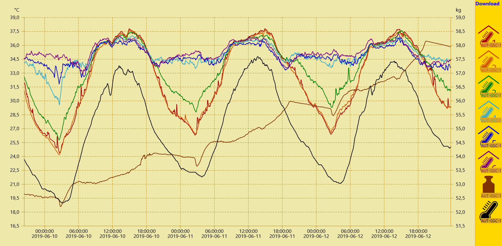
By clicking the Download button in the upper right corner a csv data file containing the selected sensor data sets is generated by the server and provided for download. This file can be opened using text editors or spreadsheet programs. However, since we also want to perform computational heavy tasks on the data, a script in the high-level programming language Python is used to read, analyse and illustrate the data set.
Nevertheless, we first open the csv file with a text editor to grasp the data set's structure. The default name of the downloaded file is data.csv. In the first line the names of the archived data sets are saved. The raw data is stored in the following lines where a line break divides two consecutive time steps. Inside a line the semicolon is used to separate two data points. Hereby we can structure the file into rows and columns. The first two columns of each downloaded csv file contain time information: in the first column as Unix timestamp in decimal representation, in the second column in a human-readable format. In the other columns the beforehand selected sensor data is stored, each column corresponding to one sensor. If data from before or after the selected 72h timespan is still stored in the file, it could now be deleted manually.
The first and last three lines with raw data from the downloaded file data.csv are printed here. The names/identifiers of the data sets are not shown.
1560117600;Sun, 09 Jun 2019 22:00:00 GMT;28,5;28;30;34;34,3;34,9;52,61;221560117660;Sun, 09 Jun 2019 22:01:00 GMT;28,5;28;30;33,9;34,2;34,9;52,61;22
1560117660;Sun, 09 Jun 2019 22:01:00 GMT;28,5;28;30;33,9;34,2;34,9;52,61;22
...
1560376620;Wed, 12 Jun 2019 21:57:00 GMT;30;30,1;32,4;34,5;33,9;34;58,04;25,7
1560376680;Wed, 12 Jun 2019 21:58:00 GMT;30;30,1;32,4;34,5;33,8;34;58,03;25,7
1560376740;Wed, 12 Jun 2019 21:59:00 GMT;29,9;30,1;32,4;34,5;33,8;34;58,03;25,6
2) Visualisation of the raw data using Python
Since we have understood the structure of the data we now want the computer to read it using a script. After that we try to visualise the raw data unaltered before we go on with further analysing steps. In the paragraphs below we use the free programming language Python 3 in combination with its external function packages NumPy and Matplotlib. Python is platform-independent and relatively easy to learn. Thus, the presented analysing methods could be applied and expanded by students with interest in computer technology, e.g. within the scope of a school project.
First of all, the data is read and saved in NumPy-arrays for plotting it over time using Matplotlib, cf. Fig. 2. Since only the relative time information is relevant to us, we can organize the horizontal time axis in units of hours with 0h representing June 09th 10 pm (UTC+0, June 10th 00 am in local time). Because both temperature and weight data is stored in the data file we will need two vertical axis: one in units of °C, the other one in units of kg. Different colours and a legend will be used to distinguish the sensors. As a guide to the eye two vertical lines with a time spacing of 24h are inserted to mark the day change at midnight in local time.
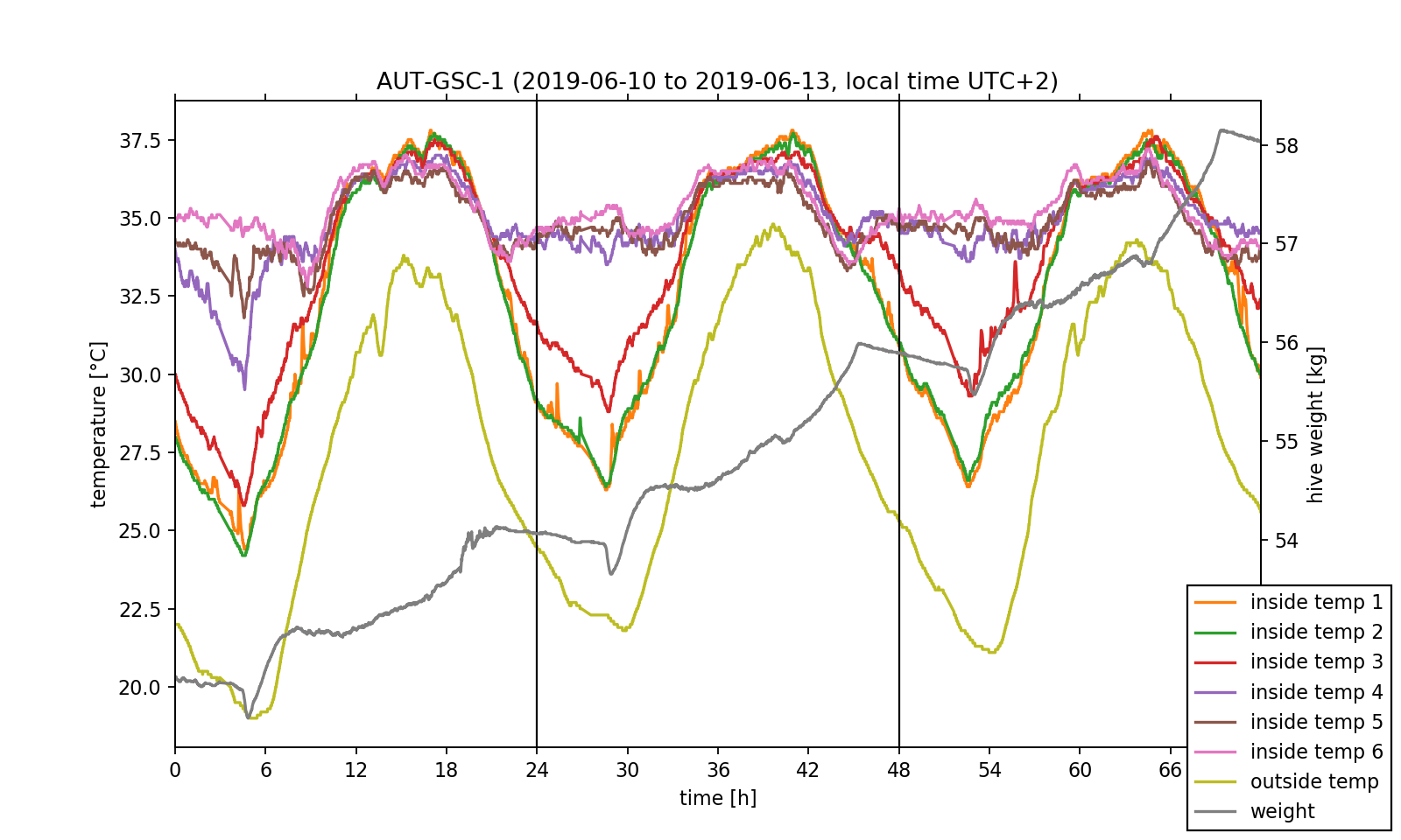
We have already accomplished the hardest task! Now, that we understood the data set's structure and managed to visualise the exported data, we can perform some investigations on it. Before doing this, we want to point out that just by looking at the temperature data one can already get an insight on the position of the bee colony inside the hive. As it can be seen in the plotted temperature curves, the inside temperature sensors 4 to 6 show little change in the measured values and fluctuate by approximately 3 °C around a mean value of 35 °C. This exactly meets the target temperature the bee colony needs for the larvae brood. In contrast, the fluctuation amplitude of the sensors 1 to 3 is nearly 10 °C. As a consequence, we can conclude that the colony mainly lives near sensors 4 to 6.
3) Analysis of the temperature regulation
We now would like to deeper investigate the observed temperature regulation as this would be possible with the diagram viewer on the BeeBIT website. Especially the differences between the temperatures inside and outside of the hive depending on the position of the inside sensor are of relevance to us. Therefore, we exemplary select sensors 2 and 5 and plot the inside-outside difference. Since we want to make a more general statement which should not be dependent on single events during data capture, we take the daily mean over the three day timespan, that is we calculate one mean temperature value out of three values measured on three days at the same time. NumPy's fast and intuitive array handling makes this an easy task. The complete 72h data set as well as the 24h mean are shown in Fig. 3. For both a shared temperature axis is used.
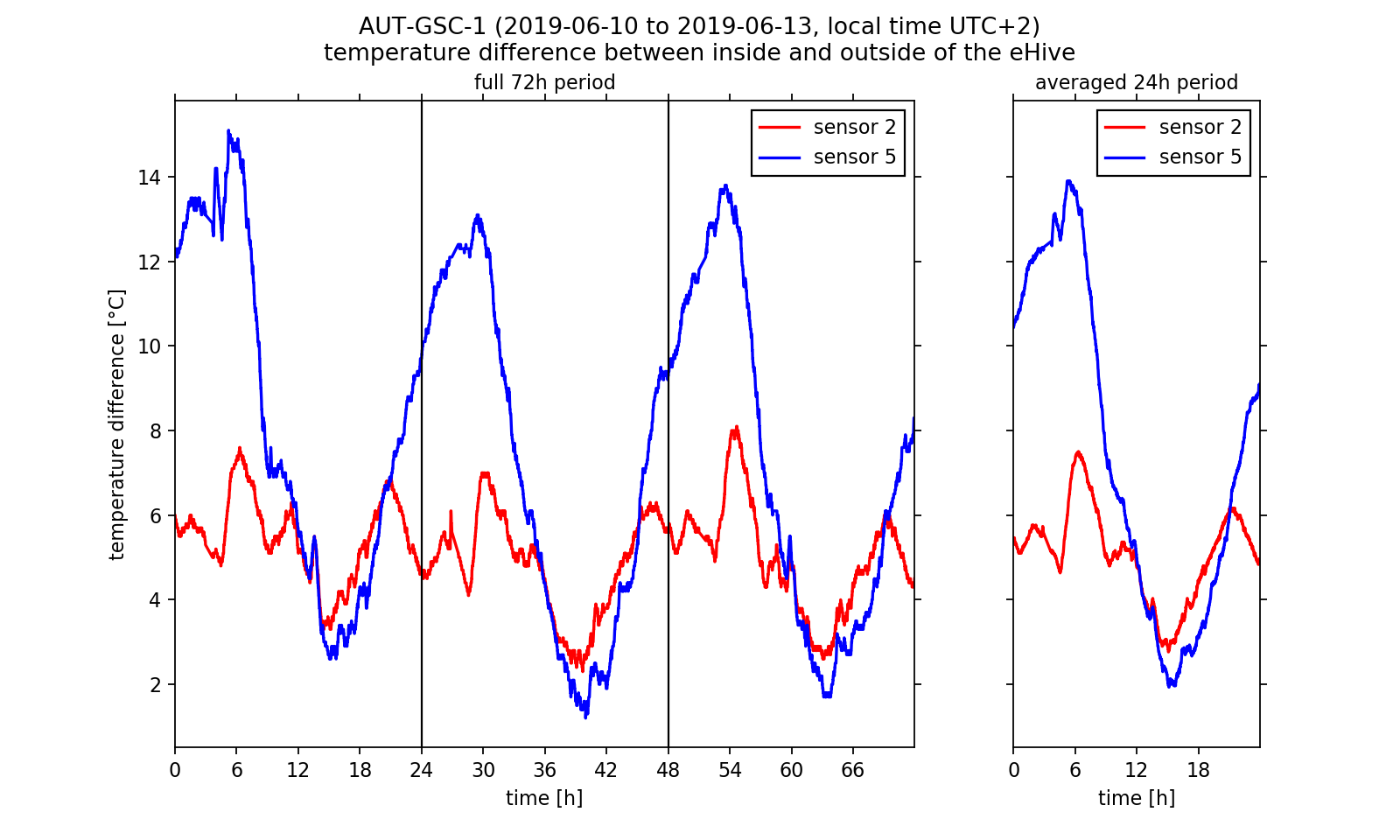
Looking at the inside-outside difference we can conclude that the bee colony regulates the hive temperature. We already have stated that the colony is located near sensors 4 to 6. During night time the hive is heated there so that the temperature does not fall too low for the larvae brood. Near sensor 2 the temperature follows the outside temperature curve. Between 2 am and 7 am the inside-outside temperature difference at sensor 5 reaches a maximum of approximately 14 °C in the three day average. We get a completely other picture if we look at the warm afternoon and evening hours: Here the temperature difference at sensor 5 falls below the values at sensor 2. If we assume that the curve at temperature 2 follows the outside temperature nearly unperturbed (with a constant offset value), we can conclude that the colony actively cools the surrounding brood-/honeycombs. Indeed this behaviour was observed by beekeepers. Worker bees carry water into the hive which evaporates and dissipated heat so that the hive stays cool. Thus, we have reason to believe that we were able to observe this interesting phenomenon in the analysed data!
4) Analysis of the weight change rate
After investigating the temperature regulation inside the eHive we want to conclude this article by analysing the weight readings. As one could already have noticed by using the website's diagram viewer, the hive weight increases from 52.5 kg to approximately 58.0 kg within the three day timespan. However, the absolute weight of the hive contains the weight of all associated components (wooden frame, sensors, IT components, biomass). Another quantity that can describe the relative weight change is of more interest to us: the change rate, that is the time derivative of the weight readings. This quantity can be calculated by subtracting two neighbouring data points and divide the result by the length of the corresponding time step. If we visualise the calculated change rate (Fig. 4, upper half) we notice that the measurement signal is very noisy. The noise reduces if we again calculate the three days mean. However, we still cannot make a reasonable statement about the weight curve using this data.
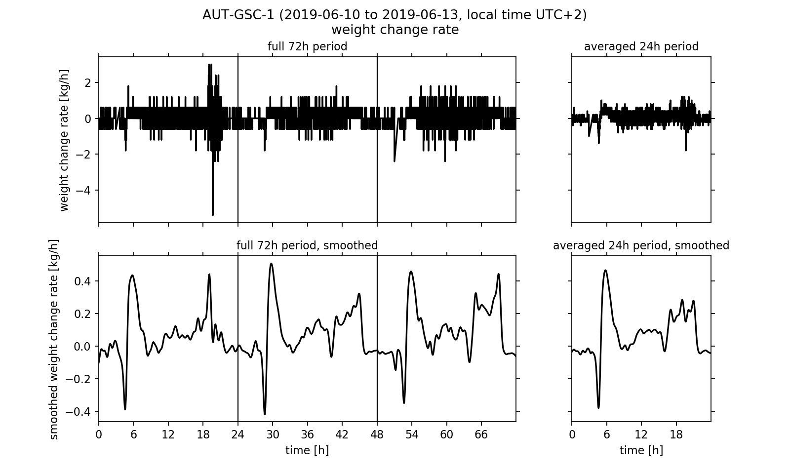
It would be desirable to process the data in a way that removes the noise from the signal without changing the underlying meaning of the measured values too much. One known method of noise suppression in signal processing is the use of signal filters. We will apply the so-called Gaussian filter to the signal. For this purpose, interpolation points are calculated from the data points. Here, the individual data points that are used to calculate an interpolation point are weighted differently. A data point that is close in time to the interpolation point is weighted more heavily than a data point many minutes or even hours away. The weighting corresponds to a Gaussian bell curve, which is centred over the respective interpolation point. Details on the interpolation and its algorithmic implementation are linked at the end of the article in the form of an explanatory PDF file.
In the smoothed curves (Fig. 4, lower half) we can see that especially in the evening between 4 pm and 8 pm the hive's weight increases strongly with up to 0.3 kg/h. Overall, a positive balance of the change rate is observed, that is in daily average it is greater than zero. This effectively leads to an increase in the hive's weight, which we already noticed at the beginning of the analysis. Surprising is the strong rash in the early morning: After the weight first decreases sharply with up to -0.4 kg/h, it rises up to +0.5 kg/h again shortly afterwards. At 9 am in the morning, the rate of change then has dropped back to about 0.0 kg/h. This effect can be seen on all three days of the observation period and is also reflected accordingly in the three-day average. Meikle et al. interpreted the sharp decline at dawn as a wake up phase of the bee colony. While the workers prepare for the first flight of the day (heavily consuming food) and then gradually leave the hive, the weight drops. The subsequent sharp increase could not be found in the publication by Meikle et al.. It may be possible, for example, that the bees carry water into the hive. However, the change in weight may have no biological cause. One can think of it being caused by the morning dew precipitating on the outside of the hive. A quick look on the website's diagram viewer could reinforce this second guess: just at the time that the weight change rate rises sharply after the wake up process, the outside humidity reaches a maximum of up to 80 % on all three days of the observation period.
5) Conclusion
We exported data from the BeeBIT diagram viewer and processed and visualised it with a Python script. The temperature regulation in the inside of the hive and the weight readings were examined in more detail. The difference between two internal temperature data sets and the time derivative of the weight curve was calculated numerically. On the latter, a Gaussian filter was applied to suppress the noise of the measurement signal. The methods shown are intended as examples of reasonable analytical approaches. Such approaches are used in scientific research, but can also be developed by students or interested adults. The eHives are providing interesting and interpretable data sets. The shown data analysis methods can be varied in complexity and their degree of difficulty. Working with just a small set of data in an easy-to-use spreadsheet program can also generate new insights. (An example suitable for school lessons can be found on the BeeBIT website in the learning materials section under the title Data analysis with simple functions and charts. There, data on outside temperature and precipitation are organised and visualized in an Excel spreadsheet.) In-depth numerical analyses, as they could be carried out in school or university projects by older pupils or students, allow a thorough study of the biological aspects of the collected data and the technical methodologies.
If this article, dear reader, has piqued your interest, do not hesitate to try it out for yourself. Download a data file from the diagram viewer, open it with a program of your choice, and take a closer look than you could before on the website. As promised at the beginning of the article: Often a second look is worthwhile.
If you need any kind of help, have questions concerning this article or want to tell us about your work with the eHives' data, feel free to contact us.
Supplementary materials
- this blog article as PDF: export_and_analysis.pdf
- used raw data: data.csv
- complete Python script: export_and_analysis.py
- supporting information, used methods and their implementation: supportingmaterial.pdf
(cw) 2019-07-20
 DE
DE